

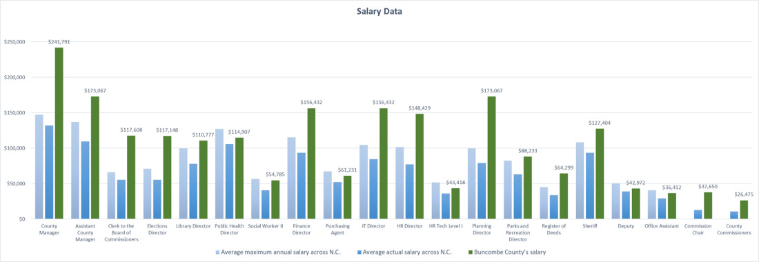
Data from fiscal year 2016 provided by the UNC School of Government shows counties pay different salary for personnel. The average maximum salary notes the highest amount an employee can make, while the actual salary shows how much that employee actually makes. Graph by Dan Hesse