


By Liora Engel-Smith, North Carolina Health News
Four months into the pandemic that led to about 1,400 deaths in North Carolina, sickened thousands more, created massive unemployment and disrupted nearly every aspect of life, the magnitude of coronavirus in the state remains hard to grasp. State officials cited some of those indicators as the deciding factors in halting the state’s reopening process and the passage of a mask-wearing mandate late last month.
To help you make sense of the numbers that led to that decision, we’ve compiled three charts that explain what’s happening with coronavirus in North Carolina.
The rise of coronavirus cases in the state coincides with the easing of stay-at-home restrictions.
Gov. Roy Cooper relaxed some of the stay-at-home restrictions right before Memorial Day weekend. Summer weather, combined with the reopening of hair salons and restaurants for sit-in dining, have meant that more people are out and about. During that time, protests over police brutality also increased the number of people in the street.
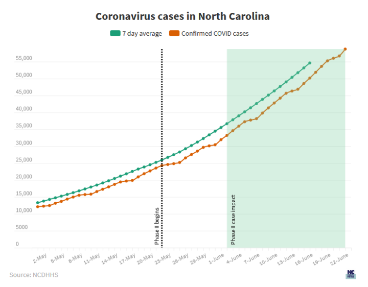 Because of coronavirus’s long incubation period (as much as 11 days) and then the time it takes for people to see a doctor for their symptoms, case tallies don’t increase immediately after someone is exposed. It can take roughly two weeks to see the impact of loosening restrictions, according to state epidemiologist Zack Moore.
N.C. Department of Health and Human Services data illustrates this trend. The state’s coronavirus cases have been climbing faster since late May, state data shows. At the beginning of May, the daily case tally and the seven-day average curve — a measure that separates a clear trend from a random, one-off rise — are closer together. But by the end of May, the two lines are farther apart, indicating that cases are climbing faster now.
The governor’s mask order went into effect on June 26 and it’ll take roughly two weeks to begin seeing its impact on cases. Data from states that already put mask orders in place, so far, show that cases decline significantly when people consistently wear masks in public.
For example, New York Gov. Andrew Cuomo imposed a mask mandate starting on April 17. Two months later, that state’s number of positive cases has dramatically declined to about one percent of the people tested.
We can tell North Carolina’s coronavirus surge is real because hospitalizations have been climbing.
Since the pandemic began, health officials have made concerted efforts to increase the number of coronavirus tests in the state. To date, more than 1 million tests have been completed, up from roughly 500,000 a month ago. But the rise of coronavirus tests isn’t the only reason North Carolina’s caseload is going up. We know that because coronavirus hospitalizations are going up.
At the beginning of the pandemic, only people who had obvious coronavirus symptoms got tested. As testing capacity increases, more asymptomatic people and those with mild illness are getting diagnosed, but the number of people with complications serious enough to be in the hospital on any given day is continuing to increase, suggesting that coronavirus is spreading through the community.
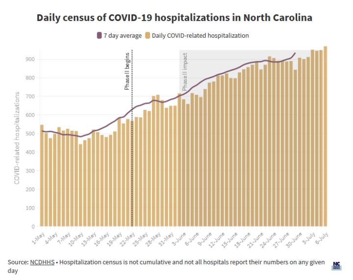
North Carolina’s COVID-19 hospitalizations dipped briefly in the middle of May near the end of the state’s lockdown. But since the easing of some stay-at-home restrictions in late May, cases have been steadily climbing. Hospitalizations topped 900 every day over the last week in June, for the first time since the pandemic began. A seven-day average, which helps with separating trends from day-to-day fluctuations that aren’t meaningful, is also trending up.
We know coronavirus is spreading because the proportion of positive cases is also increasing.
As the pandemic evolved, the state has expanded testing to include not only people with serious illness but those who may have been exposed but show no symptoms. The proportion of positive cases in the state continues to climb, meaning that the virus is spreading through the community.
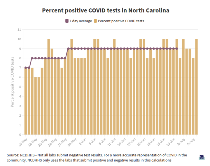
While the percent of people who test positive on any given day varies, a seven-day average illustrates the proportion of people who are testing positive — a number that is also trending upward. In mid-May, the percent of positive cases was 7%. Roughly a month later, 9% of coronavirus tests came back positive.
Not all labs that test for COVID-19 report their negative results to the state, and that has the possibility of distorting this measure, according to Moore, the state epidemiologist. Reporting only positive cases would make the spread look worse than it is. The department gets around this issue by calculating the percent positive only using results from labs that reported both positive and negative tests.
By only including the labs that report both percents of positive and negative results, he said, the department has a more accurate depiction of the spread of coronavirus in the state.
When several key indicators trend upward, spread is the likeliest explanation.
No coronavirus indicator is perfect. Hospitalizations, for example, depend on hospitals consistently reporting their coronavirus cases to the state, but not all of them do. Testing tends to capture only some of the cases, and according to an estimate from the federal Centers for Disease Control and Prevention, the total number of people who have become infected by the virus over the past six months may actually be 10 times higher. The impact of this rise on coronavirus-related deaths in the state remains to be seen because it takes several weeks or more from the onset of coronavirus to hospitalization and recovery or death from the disease.
Even with these limitations, when several indicators trend upward at once, the message is clear: coronavirus is spreading.
I hardly think those 3 graphs (well, the title says 3 but you actually posted 4) explain anything.
The first graph doesn’t even make sense. It seems to be indicating a cumulative total of cases so what is the point of the 7-day average? How can the “average” always be higher than the numbers being averaged? That defies mathematics. Also, why do you only show less than 2 months of data for something that has been going on for 5 months?
The actual graph I found at NCDHHS web site https://covid19.ncdhhs.gov/dashboard/cases shows all of the data and the uptrend in daily cases has been pretty consistent since March. It doesn’t indicate any significant changes in the curve other than the case number building momentum, which seems like a natural curve for a spreading virus. If there are any “blips”, one is clearly a surge in cases the week BEFORE the re-opening began on June 1. If you change the graph (at NCDHHS web site) to show deaths instead of cases, you can clearly see that in terms of deaths per day, NC peaked near the end of May and has been seeing a OBVIOUS DOWNTREND since then.
How is it that I can go to the exact same source that you quote for this data and the information there seems to tell a story about 180 degrees different from what you seem to be representing in this article?
As far as testing goes, the NCDHHS web site shows an 11% positive rate for the state although Buncombe County is in the 4%-6% range. Looking at the map colored by county to show the varying positive test rates, it seems obvious that the location where a majority of the testing is done will have a huge impact on the rate of positive tests. I don’t think that a fluctuation in rate is a conclusive indicator of faster or more spread, I think it just shows whether you are doing the testing in a highly infected area or not. If you want to make the rate go lower, do more testing in Polk (4%) or Buncombe (5%) or Transylvania (3%) or Haywood (4%) Counties. If you want to see a higher rate then do more testing in Mecklenburg (12%) or Gaston (13%) or Johnston (13%) or Wilson (14%) Counties. It simple math (skewing statistics 101).
It also seems important to point out that ,in NC, even though only 12% of the confirmed cases are folks age 65+, 79% of the deaths reported are in that group and we have seen ZERO deaths of anyone under the age of 25. Of the 1,552 deaths in the state, 21% have been persons under 65. That means a total of 325 people under 65 have died in NC from COVID-19. Last year NC had 1,472 fatalities from automobile collisions. It also means that the mortality rate for people under 65 in NC (325 deaths divided by 89,489 cases) is 0.3% which 3 times higher than common influenza but nowhere near the 1.0% – 3.0% rate that we were told early on. This information, in my opinion, paints a much better picture of what we are actually up against and how badly our governor and local politicians are missing the mark on their responses.
The graph on hospitalizations seems to have different numbers from the NCDHHS web site. I just looked there and saw 823 on June 13 and 1109 on July 14, so the trend on hospitalizations is currently upward, but your story reads as if those are daily admissions, which they are not. Those numbers represent the total number of persons in the hospital for COVID-19 treatment on a given day, so in the month from Jun 13 to July 14 we added 286 COVID patients to hospitals in the state, or about 10 per day. If there is any concern that we are overwhelming our hospitals (which I seem to remember was the entire basis for the “goal” of lockdowns a few months ago), at the current rate of hospitalizations, it would take 556 days (that’s a little over a year and a half for those not inclined to do the math) to fill up the 5560 currently empty beds in the state. Keep in mind that this excludes the 14,355 hospital beds that are currently in use by non-COVID patients. If we had to free those up for COVID use, it would take an additional 1435 days (almost 4 years) to fill those up at the current rate.
So, I really do not think this article and 3 (or 4) graphs has accurately explained COVID-19 in NC.