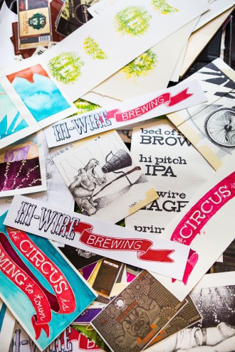
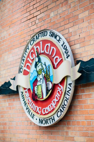
Highland has Scotty. Green Man has the Green Man. Hi-Wire has an entire circus.
Asheville’s reputation as a beer destination is chiefly due to the high-quality ales and lagers produced here. But something else is clearly going on as well: Our breweries, by and large, have a knack for branding.
Good design doesn’t just happen; it takes a lot of thought and intention to create the public face of a brand. And for most Asheville breweries, it involves collaboration.
The art of the wrap
You may never have heard of Big Bridge, a small design firm located over Limones in downtown Asheville, but you’ve probably seen the company’s work. Over the past five years, it has increasingly specialized in brewery branding, turning out everything from bottles and cases to tap handles and all sorts of promotional materials. Its client list includes Green Man, Hi-Wire, Frog Level, Burial Beer, Twin Leaf, the Asheville Brewers Alliance, Heinzelmännchen, Nickelpoint, Land of the Sky Mobile Canning, Urban Orchard, Naked Apple and more.
Why have so many Asheville breweries sought out design help?
“More often than not, what happens is a brewery is working with a freelancer, and they either lose the freelancer or it becomes more than the freelancer can handle,” says Jerry Sewell, Big Bridge’s director of business development. “But it’s a tricky thing: For most of these breweries, the amount of design work isn’t enough to employ somebody full time, either.”
If half of the equation is the labor, the other half is the specialized nature of the work. Cans and bottles are 3-D objects, and designers must consider how the art wraps in a very particular way. The same holds true for tap handles, vehicle wraps and brewery signage. Additionally, all beer packaging has to be approved by the Alcohol and Tobacco Tax and Trade Bureau; the federal agency may reject labels for a variety of reasons, notes Stephen Becker, Big Bridge’s creative director.

Hi-Wire’s circus
But even when breweries do enlist outside design help, they typically start with ideas generated in-house.
“Rarely does anyone come to us with a blank slate,” says Becker. “We come in and listen to people and try to communicate their story visually. … At the beginning, especially, we get out of the way a little bit.”
Hi-Wire had the brand concept, beer names and even an illustrator onboard before it ever met with Big Bridge. Still, the decision to work with an agency had been made months before the brewery opened.
“People want to know who you are and what you’re all about, and branding is a crucial aspect of that. We wanted to spend our energy on telling a story about who we are, and we felt we needed to reach outside the company to do that,” says Hi-Wire co-owner Adam Charnack.
Six-packs were part of the equation from day one, so a lot of the initial work focused on packaging as well as on the brand itself. “The packaging on our beers helps tell who we are — if you go to Ingles or Bruisin’ Ales or Appalachian Vintner, that’s what you see. … We need them to tell our story,” Charnack explains.
Making that happen, says Becker, required many rounds of back-and-forth with Hi-Wire’s illustrator to refine the concept, from pen-and-ink drawings to watercolor washes to the finished labels. And if you look closely, you can see Big Bridge’s hand in the final designs, says Charnack.
“I like to think of it as the ‘Where’s Waldo?’ pieces of the design,” he says. “The final typeface, and using circus imagery like tickets and ribbons … they really brought those details together and ran with what we gave them.”
Fonta Flora’s sunken skyline
For Todd Boera, brewer and co-owner of Fonta Flora in Morganton, finding a designer for the brewery’s branding and labels was easy.
“I actually went to Warren Wilson with Colin Sutherland and Mica Mead,” says Boera. “I fell in love with their art in college.”
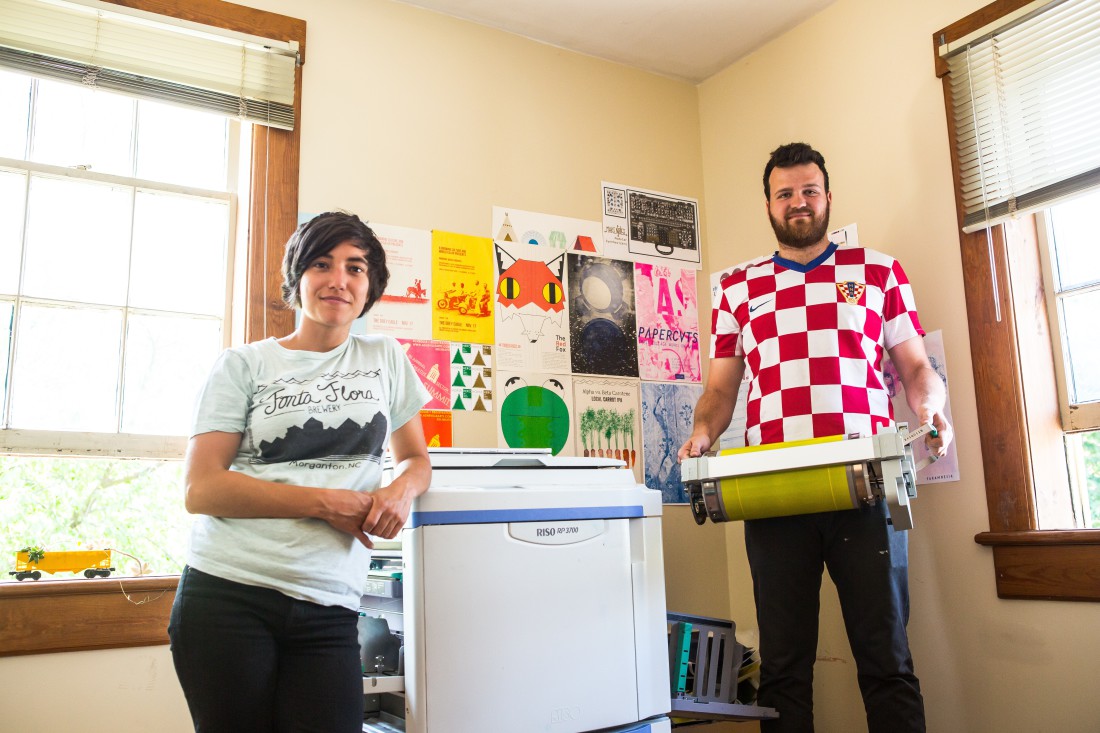
So when he started Fonta Flora years later, he connected with the pair, who had launched their own business, Woolly Press, down the road in Asheville.
Fonta Flora was an African-American sharecropper village that was flooded when Lake James was created. So Boera’s initial logo ideas centered on a submarine porthole or an old-timey diver’s helmet with the sunken village outside the window.
But that first round of designs just didn’t click, and eventually, Woolly Press came back with its own concept: a wave design above with silhouetted buildings below. That immediately made sense, and after a few more iterations, the logo captured exactly what Boera and his partners wanted.
Meanwhile, the collaboration continues with each bottle release. “The beers we bottle are ones we think are special,” says Boera, whether it’s the ingredients or how it’s brewed. “Something about each beer is unique: The label has to tell the story.”
Usually, the process starts with an idea about the beer from Boera. For Vestige Bloom and Vestige Wither, for example, he was looking to do more than just depict the ingredients (kiwi and fennel, respectively): He wanted to convey a sense of the plants’ life. After much consultation, the team homed in on the final designs, which were printed, like all Fonta Flora labels, on a Risograph.
Popular in the ’80s, the machine creates prints that are halfway between screenprinting and commercial printing — the perfect look for the Fonta Flora labels, says Boera. The images are distressed but still crisp, and with the wave design hovering up above, the soft colors seem at home underwater.
Scotty’s story
Fonta Flora’s design story is still pretty small-scale (just four bottle releases so far). But collaboration also plays a key role over at Highland, Asheville’s oldest and biggest homegrown brewery.
On most projects, the in-house design team — president Leah Wong Ashburn and packaging manager Greg Ferguson — works closely with Tim Kilmer at BP Solutions. But there may be other, unexpected outside influences, too.

“For our recent rebrand, we had a round of designs nearly finished, and we reviewed them with one of our biggest customers,” Ashburn recalls. “He looked at the design and asked why our boxes didn’t match our six-pack holders. We didn’t have an answer: That was just something that had always been that way. But the more pieces this customer saw, the more he thought it didn’t work, that it wasn’t cohesive. So one person’s input sent us back to the drawing board, and it really affected our redesign.”
Highland, she notes, is always looking for other ways to tell its story, whether it’s the Scottish symbols used on the new packaging, the tartan/plaid motifs, or Scotty, the brewery’s mascot.
“Scotty’s been around since day one, but he’s morphed,” Ashburn explains. He first appeared in brochures as a small figure walking along the backdrop of the Blue Ridge Mountains, says head brewer John Lyda. Then Roy Parker, a designer Highland consulted with at one point, convinced the company that Scotty should be more prominent, with a recognizable face. Around 2000 or so, the company transitioned to the woodcut version of Scotty developed by the design firm Wilson, Coman & Taylor. And even now, says Highland founder Oscar Wong, the company occasionally gives Scotty a face-lift.
Industrial chic
For local breweries, though, the design challenges aren’t limited to packaging and specialty items. There’s also the taproom to consider.
“We’re always continuing to work and evolve our space,” notes Ashburn. “And even though we have a big expansion going on and the roof design will be on another level, we want to stay true to the way people feel when they walk in now: It’s comforting, inviting, warm and casual. We call it industrial chic.”
Asheville architect Robert Todd worked with Highland on both the initial and current designs, right down to the signature repurposing of railroad cars as offices and bars.
Meanwhile, another big example of taproom as branding tool is coming soon to Asheville: New Belgium’s Craven Street space.
“In Fort Collins, we’ve had our tasting room since 1995,” says beer ninja Tyler Foos. “It’s a dream to be able to sit down and put to paper what we’d do differently if we could do it all over again.
“Breweries are gathering places, and for a lot of people, meeting at breweries is a huge part of living in Asheville. … So we’re really having fun thinking about it as a gathering place for locals, as much as it is a place for traveling craft beer enthusiasts,” he explains.
To that end, New Belgium has an open call out to everyone from letterpress artists and screenprinters to 3-D artists and furniture designers. The review, notes Foos, is just getting going, but the brewery is excited about collaborating with both well-established and lesser-known local artists.
“Maybe you’ll come in when we open and see something familiar,” he says. “Or maybe you’ll walk in, see something that catches your eye and ask, ‘Who designed that?’”


Before you comment
The comments section is here to provide a platform for civil dialogue on the issues we face together as a local community. Xpress is committed to offering this platform for all voices, but when the tone of the discussion gets nasty or strays off topic, we believe many people choose not to participate. Xpress editors are determined to moderate comments to ensure a constructive interchange is maintained. All comments judged not to be in keeping with the spirit of civil discourse will be removed and repeat violators will be banned. See here for our terms of service. Thank you for being part of this effort to promote respectful discussion.